technology
A website Federico can edit without calling me
Federico runs EVia Solutions in Luxembourg. He’s also a good friend. We rebuilt his website in French, English and German, with an editing setup he could use himself and a server we continue to maintain.
Being friends makes the handover more important. He knows where to find me.
The site went live at eviasolutions.eu on 25 August 2026. The visible work is green, tidy and full of charging equipment. The less visible work involved German menu labels, three separate contact forms, a consent banner that moved the page and some JSON that looked fine until we tried to edit it.
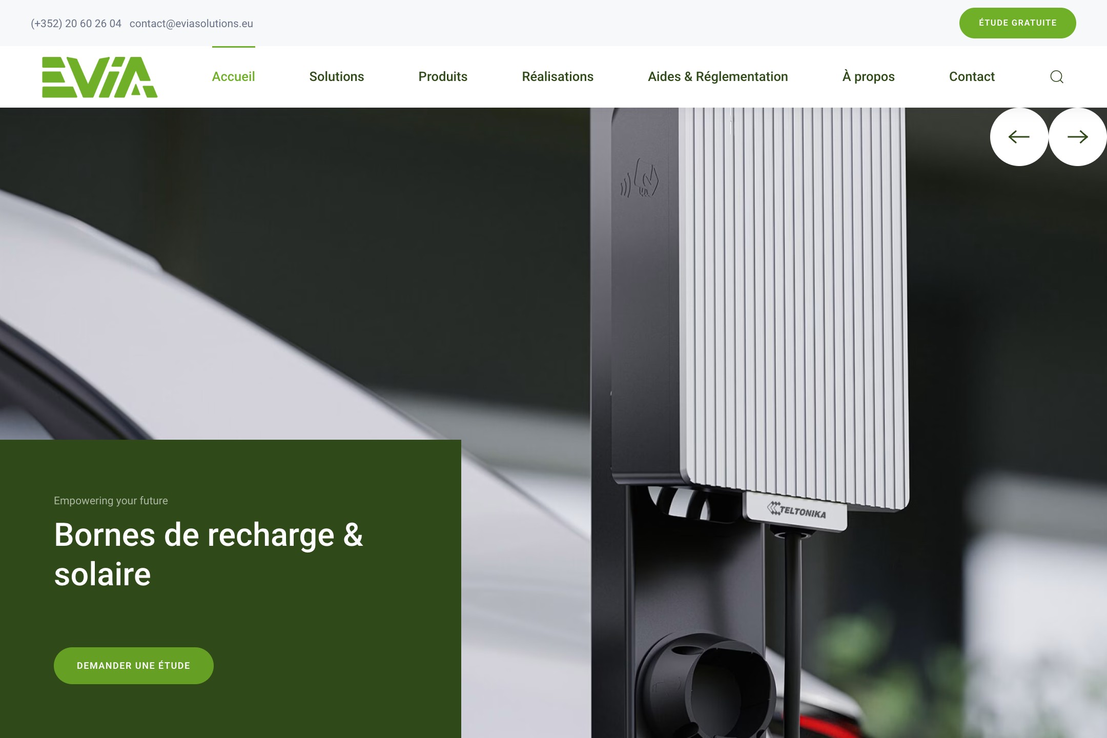
French homepage, captured on 23 October 2026. Screenshots throughout this post show the real public site.
We started with a dentist
The starting point was YOOtheme’s Union Dental layout. A dental practice and an EV charging business have limited overlap, but the layout had useful proportions, navigation and content sections. We could adapt those inside the builder.
We changed the palette to EVia’s greens, replaced the typography with Roboto, rebuilt the navigation around EVia’s services and replaced provisional visuals with Federico’s product photographs. His third feedback batch included four photos, which went into the homepage, service cards and product pages.
That last part matters. A photo of the actual charger answers questions a pleasant abstract illustration cannot: what does it look like, where does the cable go, is this the wall-mounted unit or the one on a stand?
The YOOtheme page builder gave us native elements and settings for the layout. We used its UIkit styling, menus, widgets and dynamic content sources. Federico can open a page and work with the same building blocks we used.
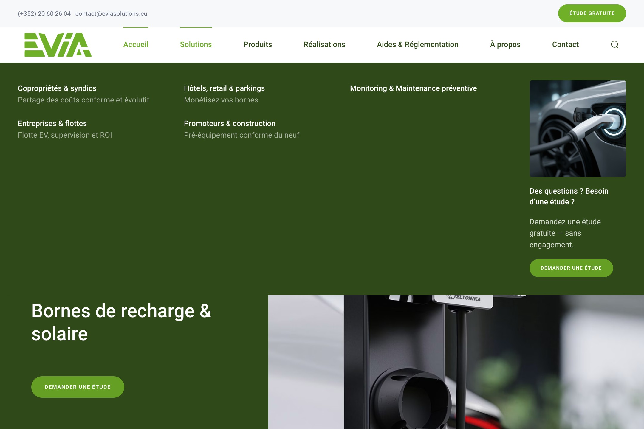
Navigation groups the work around the people buying it: residential buildings, companies, hospitality and property development.
We also had to agree which green belonged where. The final dark green appears in headings, the hero panel and the large call-to-action sections. This sounds minor until three almost-identical greens have entered the room and each has brought a different button style.
The editing screen is part of the delivery
The rule for this build was simple: ordinary content changes should have a home in WordPress admin.
| Federico wants to change | Where it lives |
|---|---|
| A page’s text, image or layout | YOOtheme Builder |
| A navigation label or link | WordPress menus |
| A translated page | Its linked Polylang translation |
| Contact fields and response messages | Contact Form 7 |
| Search titles and descriptions | SEOPress fields |
We used SEOPress for metadata and sitemaps. Our separate Hong Kong SEO research for Lyfar Studio shows how we investigate search terms before making page decisions. Installing an SEO plugin doesn’t make those decisions for you.
Native components still needed some compatibility code. YOOtheme stores shared footer and widget layouts separately from the translated pages. We added small plugins to select the correct menus and translate shared interface text. The French originals remain editable in the builder; changing one of those shared phrases also requires updating its translation mapping. That limitation belongs in the handover.
The same principle appears in our Shopify storefront experiment : give the owner a familiar place to change the content that matters. The unusual part of the design shouldn’t make routine edits depend on us.
Three languages means three complete journeys
We kept French as the source and used Polylang’s linked pages for English and German. Each translation is a real WordPress page that Federico can edit.
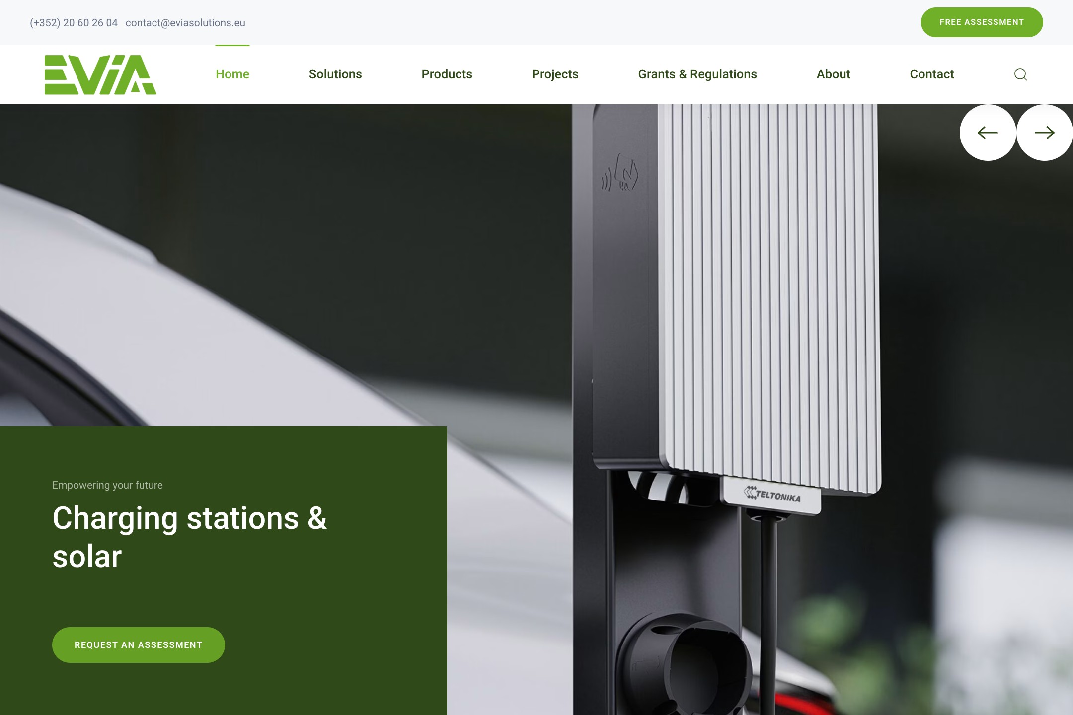
English homepage. The navigation, page copy and calls to action need to agree on the language.
Translating the central text is only part of the job. Menus, footers, form labels, validation messages, search metadata and consent controls all have their own storage and behaviour. We found that the translated contact pages initially embedded the French form. The page had learnt English; the form had declined the invitation.
We gave each language its own Contact Form 7 form, including response messages and mail subject, then recorded which page uses which form. The translation script preserves that mapping when a page is rebuilt. Otherwise you can fix the form on Monday and have your own automation put the French one back on Tuesday.
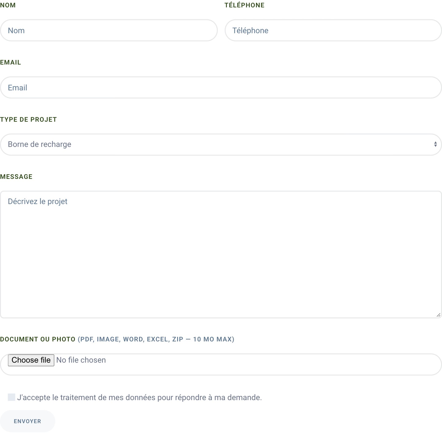
The form is a separate editable component. Translating the page around it does not translate its fields or messages.
German supplied another test. A longer navigation label pushed the search icon onto a second row. We shortened the menu label from “Förderungen & Vorschriften” to “Förderungen & Recht” and kept the full page title. A native menu edit fixed the problem without shrinking the whole site to accommodate one phrase.
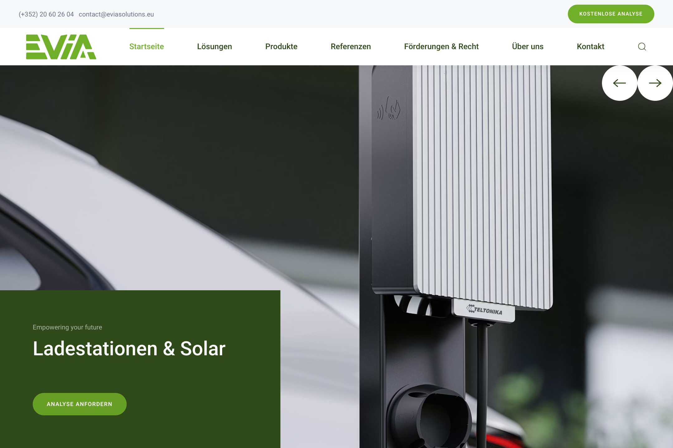
German homepage. We tested the header with the actual translated labels.
On mobile, we checked the off-canvas menu too. YOOtheme uses different widget areas for desktop and mobile navigation. Assigning a menu to a WordPress location alone didn’t populate the desktop navbar in this setup. The mobile menu worked while the desktop one was missing. We added the proper menu widget and checked both views.
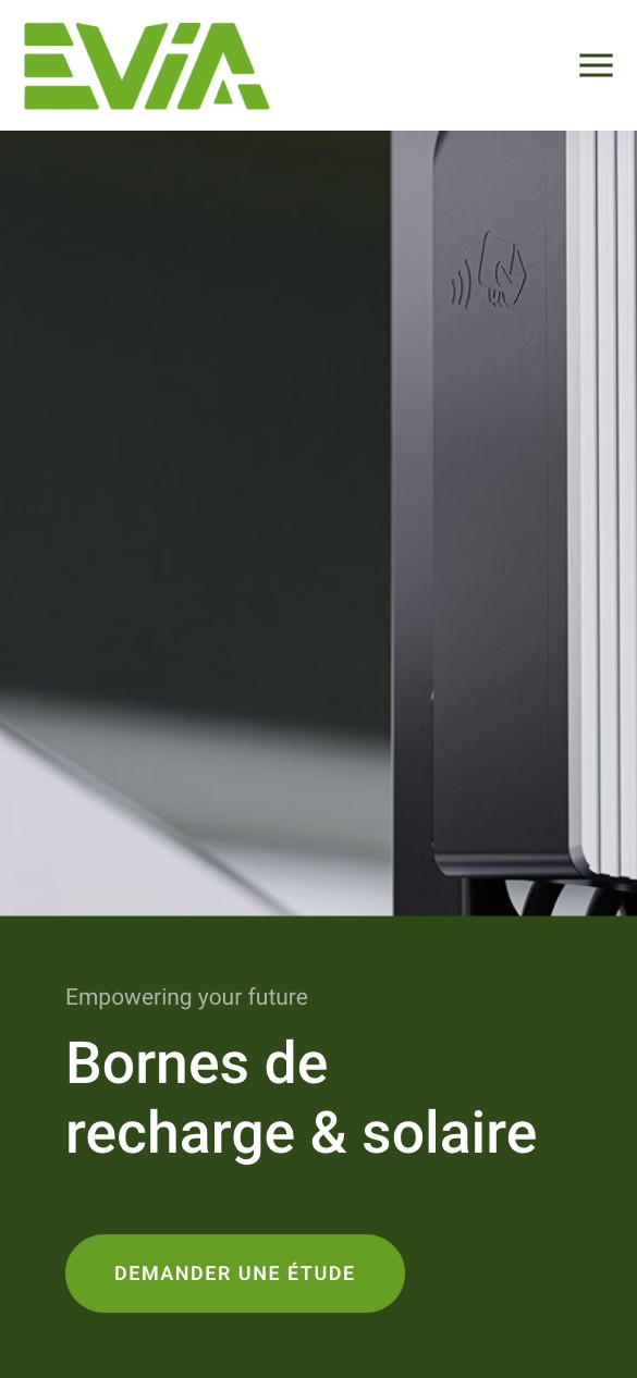
Mobile browser capture. A separate layout check, rather than proof of a physical-phone test.
The cookie banner wanted more space
During the optional chatbot work, the consent banner caused a visible jump. Its top-of-page position sat in the document flow and pushed content down: 76 pixels on desktop and 133 on mobile in the July investigation.
We first suspected the font. A preload experiment didn’t fix the shift. Measuring the moving elements led us back to the banner.
The chatbot trigger also overlapped the reject button. Asking for consent while covering “Reject” is a poor start to a conversation.
We moved the banner to the fixed bottom position and connected the chatbot to YOOtheme’s consent mechanism . Its scripts waited for permission before running. A small bridge then called the chatbot’s own initialization function after consent.
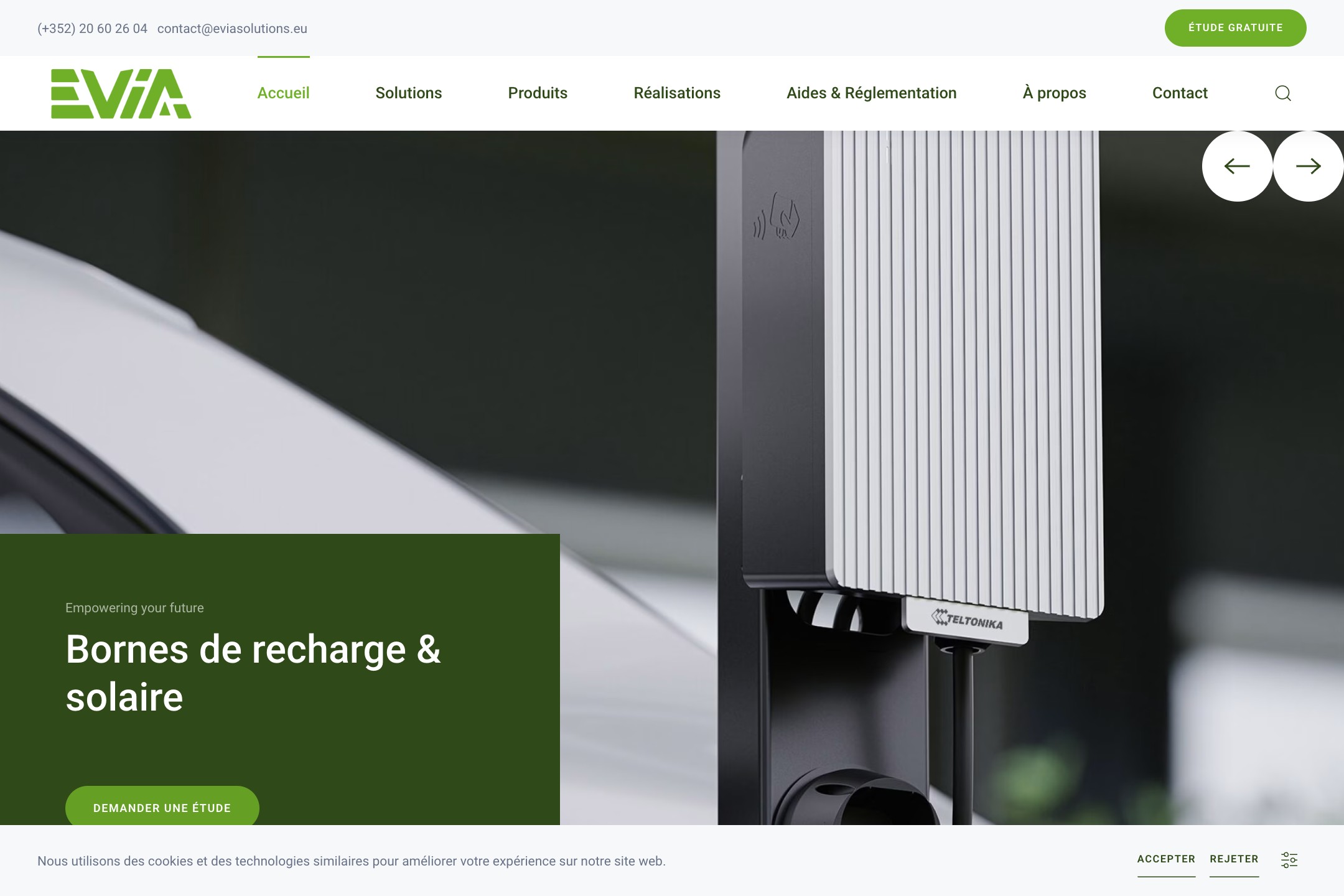
Current consent interface. The debugging story describes the July build; this screenshot is not a claim that the optional chatbot is active today.
The first bridge missed returning visitors. It listened for a new consent click, but someone who had accepted on an earlier visit didn’t make that click again. We added the stored-consent path and checked three journeys: accept now, reload after accepting, and reject.
Those checks matter more than a screenshot of a nicely positioned button. You need to know what happens after someone uses it.
The page looked fine. The saved layout wasn’t.
One development mistake deserves a place here. We tried to fill image descriptions in bulk by decoding and re-encoding YOOtheme’s layout JSON. That broke 24 development pages. Cached output kept them looking normal, so a glance at the frontend didn’t reveal the damage. We restored the development content from production; client pages weren’t affected.
A related trap came from WordPress’s handling of escaped strings. Its post-update API expects escaped array input. Builder JSON contains meaningful backslashes, so an otherwise reasonable save can strip something the builder needs. The relevant step looks like this:
wp_update_post([
    'ID' => $page_id,
    'post_content' => wp_slash($builder_content),
], true);
WordPress documents both the input expectation and wp_slash . That snippet only addresses escaping. Our verification also reads the saved value back, checks the layout JSON and opens the builder. A page that renders from cache still needs an editable source underneath it.
Launch was a date, not the end of ownership
The 25 August launch included the main-domain switch, HTTPS, old-page redirects and opening the site to indexing. The recorded performance audit gave desktop 100 and mobile 76, with the homepage image still costing time on simulated 4G. Those are dated measurements; the July score of 95 came from an earlier run and doesn’t make the August limitation disappear.
We tracked the work and feedback on the studio project board , then turned the milestones into Typst progress reports . That gave Federico somewhere to see the work between calls.
Federico has a live site in three languages and ordinary content controls he can use. We still handle the plumbing. That’s a reasonable division of labour between friends, especially when one of them has already spent enough time thinking about German cookie buttons.
Interested in this?
Learn about Technology →